Nintendo Office in Windsor
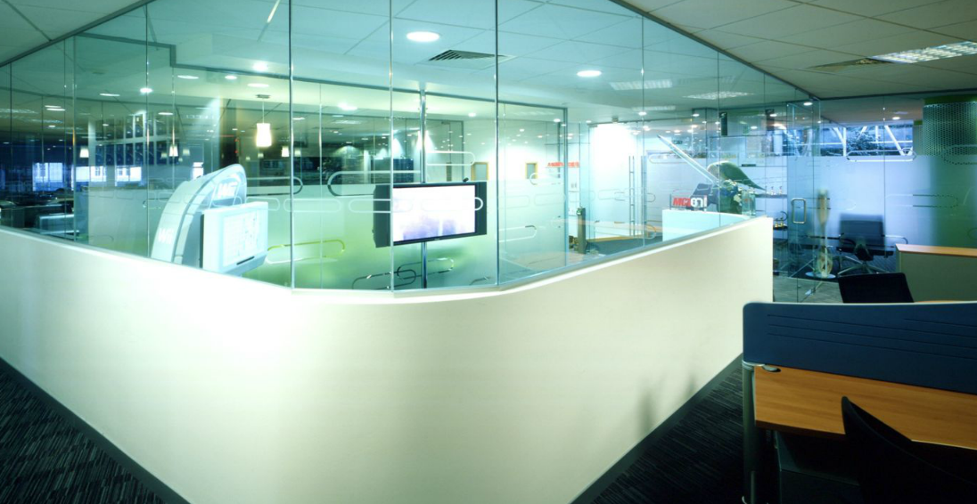
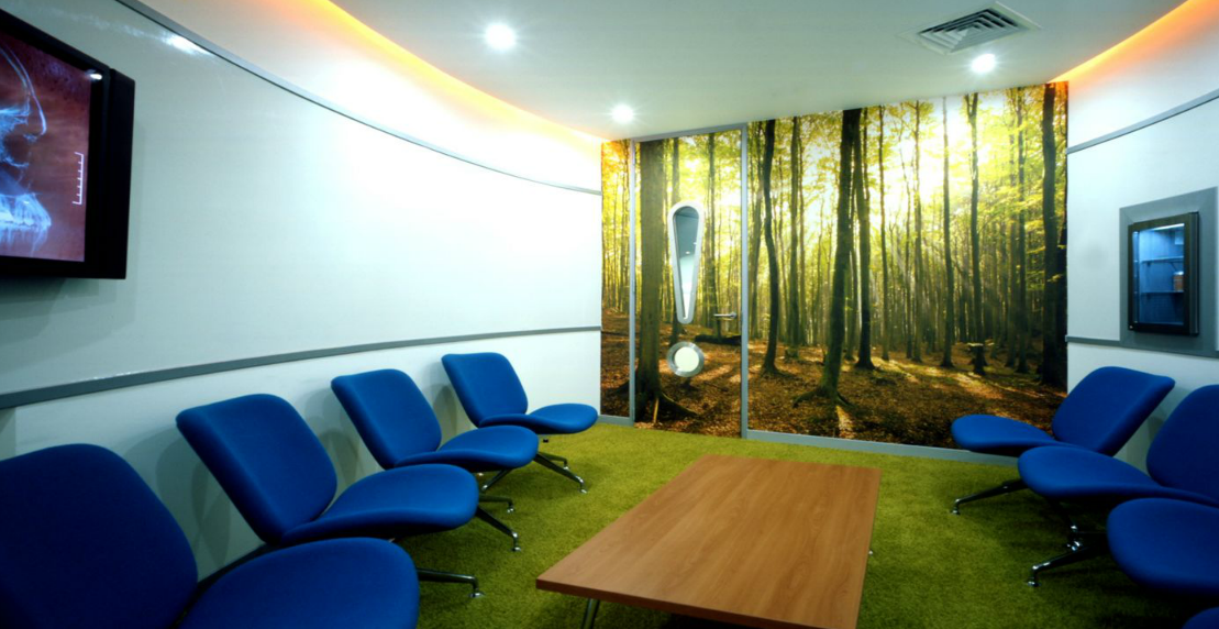
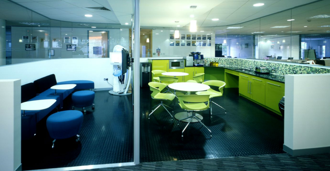
Nintendo recently relocated their HQ to an office in Windsor. The aim of the fit out was to give the space a modern design yet at the same time maintaining Nintendo’s fun and funky corporate image. One of Nintendo’s requests for the space was that the office reflect the company’s corporate image and identity, but at the same time they didn’t want heavy branding or over use of corporate colours.
Carrie Spooner, Designer at Area Sq says:
We introduced vibrant colours such as bright greens and blues as well as subtle branding in the glass partitioning.

[via]

