Quid Office Space – Studio O+A
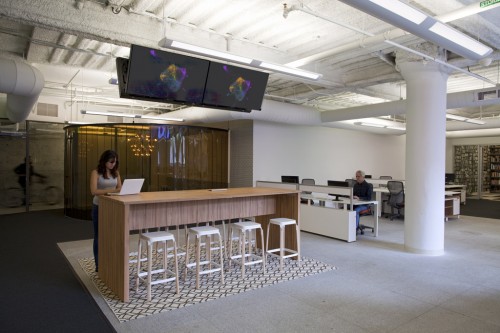
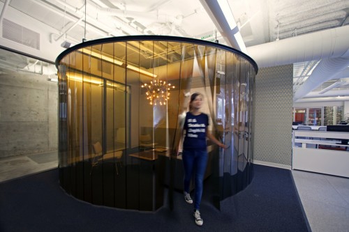
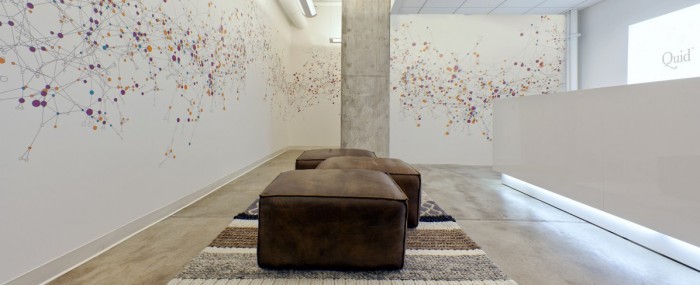
Quid is a company which designs software for various complex data handeling purposes. It is therefore unsurprising that the large graphic in their lobby feature a colourful array of data points based on actual Quid customers. Designed by studio Studio O+A, the office is stylish yet functional.
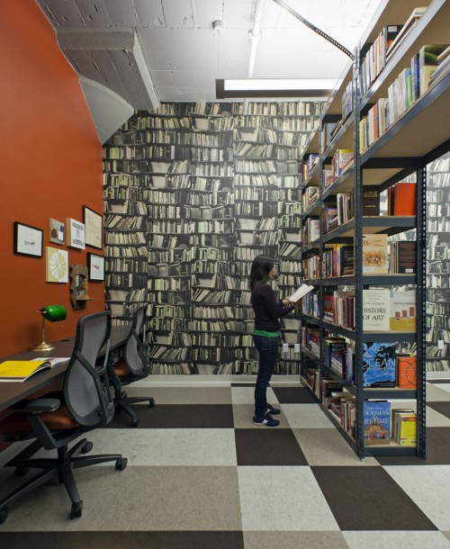
One important feature of this office space is the Library, it was designed to be a useful and enjoyable resource for the company’s staff. It was given careful thought from the beginning, and as such Studio O+A states:
Library spaces are proving increasingly important to our workplace design – open plan is great for collaboration but can leave people without anywhere to concentrate. We create libraries as a respite for concentration and focussed work. Regardless of book quantity, the very connotation of “library” means people understand the concentrative aspect of the space.

[Photos by Jasper Sanidad via Office Snapshots]

