Colour Matching In Office Decoration Design
In office design decoration, the combination and use of colours is an important part. Proper colour matching can only create a comfortable office environment but also improve employee productivity. According to the characteristics of different companies, the colours used are different.

Uniform Tone
In general, office design should not use too many colours, otherwise, it will easily cause “visual pollution”. It is best to use the same colour system for colour matching among wall, ceiling, flat layout, partition setting, etc. The change of colour difference makes the vision not simple.
Cleverly Match Bright Colors
If the office is dark, it will give people a sense of depression and easily annoy employees. If the colour of the office is bright, it will give people a pleasant and warm feeling, which is conducive to the improvement of employee productivity.
Therefore, for backlit offices, bright colours should be used to make up for the lack of space. In low-rise office buildings, you can use elegant light colours to neutralize the discomfort of the building itself. In addition to improving the office level, it can also play a visual effect of expanding the space, such as using light blue and light green as wall surfaces.
Different Colors In Different offices
Different colours represent different working atmospheres. Leadership should be as dark as possible, reflecting stability and atmosphere. Offices that require operators to work carefully and pragmatically should choose elegant colours that can make people calm. The operator’s thinking office can choose bright and bold colours, and the impactful design can inspire people.
Office Furniture
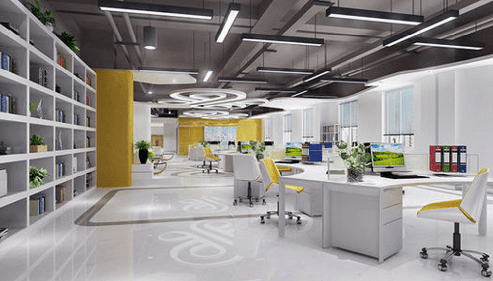
The harmonious and unified color of the office is not only reflected in the design, but also all kinds of office furniture occupying a large area in the space. The color of the tables and chairs can be consistent with the color of the wall, or it can be used to embellish the entire space with more lively colors. In general, desks can be light gray, white, or wood, while seats can be enriched with some jumping colors.
Wood Color + White Means Harmony
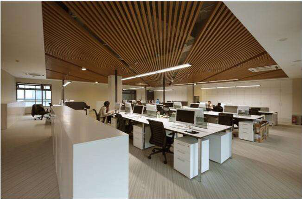
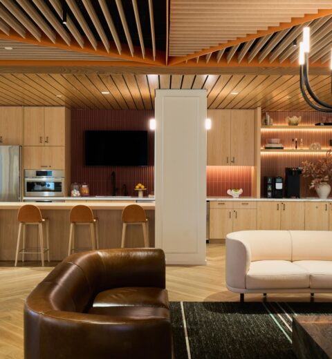
White and Wood colour have soft colours like a spring breeze, nature is casual, and space is harmonious. More and more wood colours are now used in office ceilings, partitions, walls, and decorative shapes. These decorative materials are made of aluminium profile or aluminium plate, and the colour of the woodgrain on the surface is more harmoniously integrated into the space design.

Blue + White means Rational
The blue hue helps to create a calm atmosphere, making people emotionally stable and rational. The cool and flawless white feels free and open.
– Blue + Orange means Modern, these two colours can breathe new life into space.
– Light Yellow + Green means Natural
– Light yellow is a tender colour that represents the joy of a new life.
– Apple green is a calm hue that can neutralize the shades of yellow.
– Black + White + Gray means Classic
Simple style, mainly in black or grey. Black and white can create a strong visual effect, incorporating grey into it, alleviating the visual conflict between black and white. This space is full of rationality, order, and professionalism.
Colour is both art and tool in office design. Colour can inspire employees and convey corporate culture. When colour is integrated with corporate culture, it is the best expression of colour matching.
Photo credits: Fannov


