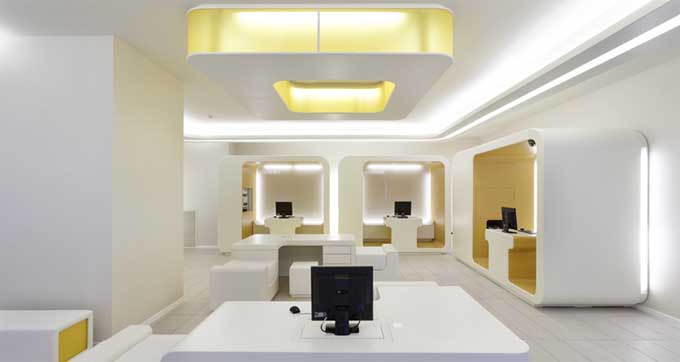
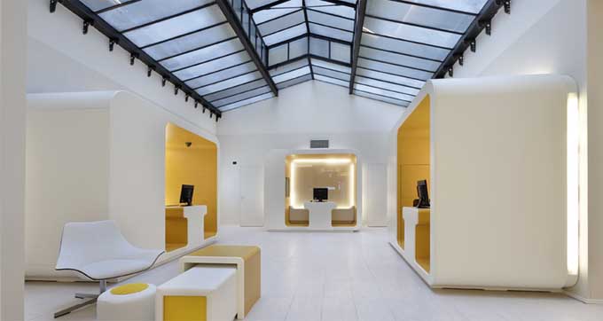
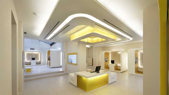
CheBanca! – Milan
With the advent of online banking, thankfully visiting the bank has become a less frequent occurrence. I say thankfully for a reason, we all know that going to the bank is a time consuming and dull event, one to be avoided at all costs! To add insult to injury, most central city banks are located in huge buildings which exude grandeur and importance, intended to intimidate and impress. Is this really what we want from banks in the 21st Century? Some banks have made efforts to spice up their retail fronts, but in all honesty they haven’t really been that great in terms of design. More a case of same old with a modern twist rather than anything really revolutionary. This is why we were so impressed with CheBanca! which is located in Milan. The name literally translates to What a Bank!, and they have recently launched a new design concept which they have implemented in their retail locations.
The Project was headed by Crea International, intended to reflect the bank’s focus on simplicity and transparency. It was also intended that the new retail space stand testament to the bank’s innovative aspirations. Crea Interanational has also designed the corporate identity of other brands in Italy, these include Unicredit Banca, Vodafone and others.

